You are using an out of date browser. It may not display this or other websites correctly.
You should upgrade or use an alternative browser.
You should upgrade or use an alternative browser.
Build Thread '83 T-top Coupe - Welding Holes in My Rear
- Thread starter Davedacarpainter
- Start date
- Status
- Not open for further replies.
-
Sponsors (?)
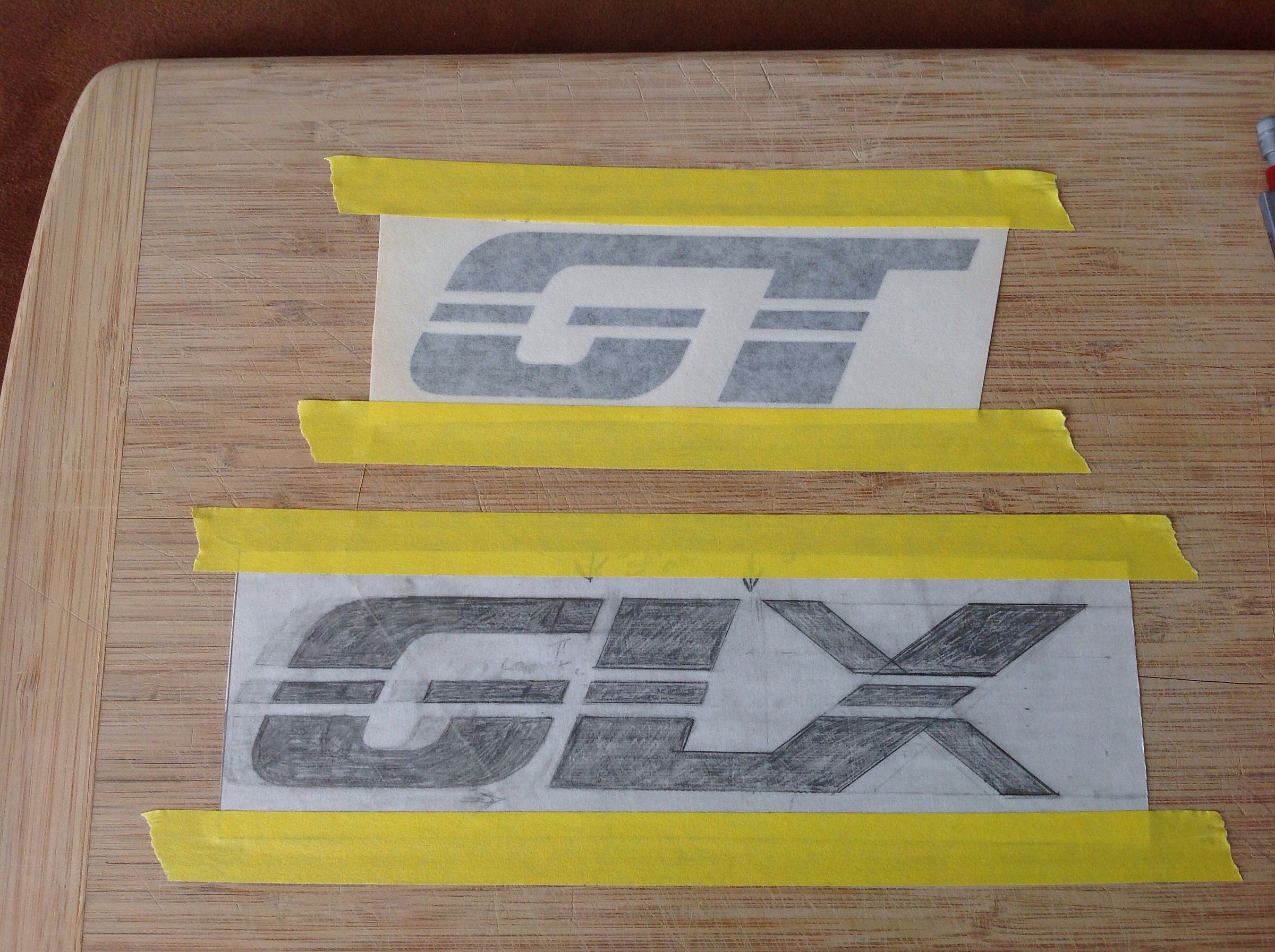
Ok, look at my high tech modification drawing and see what you think.
Or just connect the top of the G to the L?
Alright @madmike1157 , i know you don't like the idea, but what do you think of my GLX transfer?
Or you @mikestang63 ?
I like either of these two, very nice.
I think it flows better with the G attached to the L, but I still think it needs moved closer to even the gap between all three letters.
I've looked at it.Ok, look at my high tech modification drawing and see what you think.
Or just connect the top of the G to the L?
Alright @madmike1157 , i know you don't like the idea, but what do you think of my GLX transfer?
Or you @mikestang63 ?
I think your revision is on the right path.
The original w/ the un-attached G made it look that way....un-attached.
Maybe it just needed to be pushed closer to the L?
The connectors you've added don't necessarily work because in the GT version, the T just works attached.
I do think that when you push the X away then the gaps will be right, and the connected version would work best.
Too bad there wasn't a way to fade a color on the "bridge" that ties G through the L, to the X, like maybe the G to the top break line on the L is one shade, and the bottom of the L underneath the break line through the x is another color or shade, and all three of the middle bars are the same 3rd color/shade ?
A vinyl shop could do that,..and you being the painter that you are could certainly do it as well,.....Maybe this is just another example of a Raggedy suggestion, and waaay more work than what it's worth.
Like branding a door panel.
Bing!!!
The bottoms, and tops of all the letters are all the same color, the rectangles are all the same but a different offset color, then drop the G link, and let the colors tie the letters together.
Charcoal letters, pewter bars?
Last edited:
I think he is on to something. ^
Move the G over right, or maybe stretch the X over to the right instead, and then do that fade trick. Boom.
Move the G over right, or maybe stretch the X over to the right instead, and then do that fade trick. Boom.
I've looked at it.
I think your revision is on the right path.
The original w/ the un-attached G made it look that way....un-attached.
Maybe it just needed to be pushed closer to the L?
The connectors you've added don't necessarily work because in the GT version, the T just works attached.
I do think that when you push the X away then the gaps will be right, and the connected version would work best.
Too bad there wasn't a way to fade a color on the "bridge" that ties G through the L, to the X, like maybe the G to the top break line on the L is one shade, and the bottom of the L underneath the break line through the x is another color or shade, and all three of the middle bars are the same 3rd color/shade ?
A vinyl shop could do that,..and you being the painter that you are could certainly do it as well,.....Maybe this is just another example of a Raggedy suggestion, and waaay more work than what it's worth.
Like branding a door panel.
Bing!!!
The bottoms, and tops of all the letters are all the same color, the rectangles are all the same but a different offset color, then drop the G link, and let the colors tie the letters together.
Charcoal letters, pewter bars?
I think he is on to something. ^
Move the G over right, or maybe stretch the X over to the right instead, and then do that fade trick. Boom.
I agree with moving the G over, possibly still leaving it linked at the top to the L. I'll see what it looks like after i redraw it.
I don't want to stretch the X out farther, i'm trying to keep this from being too long. I think it could be too much of a distraction, as opposed to being an accent if i make it any wider.
Colors?.....My original plan was to use this as a stencil that i would lay onto the blue surface and then paint the dark grey pearl for the main hood stripe, remove the stencil and have this as a kona blue GLX. The idea of maybe painting the center bars a different color is interesting, maybe a silver for them? I think silver is about the only color i could use and remain "tasteful".
I'll get to redrawing and show you that when i finish it up.
Ok, before and after, what do you think now? I didn't bridge the G to L in this rendition.


Last edited:
Middle version looks good. Have you thought about disconnecting the bottom of the X from the L's bottom, then moving the X over to create the same top gap as the G has?
Yeah, the problem is that it gets to be too wide to look right to me then.Middle version looks good. Have you thought about disconnecting the bottom of the X from the L's bottom, then moving the X over to create the same top gap as the G has?
So, you think no connect between the G and the L?
I vote for pic three. No connection between the G and L, but the spacing makes it look good. Dont want it to be too busy and unable to be understood at a glance. Being you are just using the blue to shine through, I wouldnt mix a third color. Just let it be.
Just studied them again. Definitely like pic three as is.
Just studied them again. Definitely like pic three as is.
I vote for pic three. No connection between the G and L, but the spacing makes it look good. Dont want it to be too busy and unable to be understood at a glance. Being you are just using the blue to shine through, I wouldnt mix a third color. Just let it be.
Just studied them again. Definitely like pic three as is.
No, No, No!!!
Go work on your stocker....leave the creative sht to me.
@Davedacarpainter
Use the middle bars as a link. silver, slate, pewter,...... something to tie the thing together. Not a giant contrast,...just a slight of hand to let somebody that pays attention know that you tried to make it cohesive.
Yeah, but Mike the letters are going to be the blue paint of the hood. Any shade of gray is very different from the blue. Why not just leave good enough alone versus having a stand out line through it?
Edit: Seems this reminds me of another disagreement of ours.... The Monster's grille.
Edit: Seems this reminds me of another disagreement of ours.... The Monster's grille.
You know, i could use a lighter color grey for them at that. They don't have to be silver....I'll talk to my buddies at the paint shop too. A grey that's midway between silver and the dark gray of the stripe would be a nice little accent without being gawdy. Though silver would help it to stand out a little since kona blue and the grey are both so dark. It would draw some attention without have to put a clown's face on the hood.No, No, No!!!
Go work on your stocker....leave the creative sht to me.
@Davedacarpainter
Use the middle bars as a link. silver, slate, pewter,...... something to tie the thing together. Not a giant contrast,...just a slight of hand to let somebody that pays attention know that you tried to make it cohesive.
I've been thinking about it Nick. Kona blue looks almost black without the sun shining on it. The GLX might just disappear in a way.Yeah, but Mike the letters are going to be the blue paint of the hood. Any shade of gray is very different from the blue. Why not just leave good enough alone versus having a stand out line through it?
Edit: Seems this reminds me of another disagreement of ours.... The Monster's grille.
Oh well, i have a couple days before i'll shoot it.
BTW, my son favors having the G connected to the L....hum.....
Anyone else got thoughts? @RaggedGT @A5literMan @a91what @90sickfox @84Ttop @TOOLOW91 @ARBOC39 @Boosted92LX @hoopty5.0 @Mustang5L5 @cleanLX @stykthyn @Chuckman etc.....
Last edited:
Dave, I like the 3rd and 4th rendition best. I'd probably have to see it on the car to choose between them, although I'd give a nudge to the 3rd one. Also, I think I might like to lean the letters over to the right just a tick, would make it a touch more racy. Silver would look great with Kona blue. That's my $.02
I'm trying to do the same font as the GT sticker in the picture. Period correct, even though it wasn't an option.Dave, I like the 3rd and 4th rendition best. I'd probably have to see it on the car to choose between them, although I'd give a nudge to the 3rd one. Also, I think I might like to lean the letters over to the right just a tick, would make it a touch more racy. Silver would look great with Kona blue. That's my $.02
I've been thinking about it Nick. Kona blue looks almost black without the sun shining on it. The GLX might just disappear in a way.
Oh well, i have a couple days before i'll shoot it.
BTW, my son favors having the G connected to the L....hum.....
Anyone else got thoughts? @RaggedGT @A5literMan @a91what @90sickfox @84Ttop @TOOLOW91 @ARBOC39 @Boosted92LX @hoopty5.0 @Mustang5L5 @cleanLX @stykthyn @Chuckman etc.....

I like this version Dave,and I'm a fan of using a subtle dark silver or pewter color with it . What I wanna know Dave-which version/color option do YOU favor ?
That's my favorite. My boy likes the last one.
I like this version Dave,and I'm a fan of using a subtle dark silver or pewter color with it . What I wanna know Dave-which version/color option do YOU favor ?
I kind of like mike's idea of using a lighter grey for the center stripe. I might just do that, it really wouldn't be overly difficult to do either.
- Mar 2, 2015
- 6,822
- 5,858
- 203
I like the third one the best...but I think the bottom gap from the g to L needs to be closed up a pinch. I'd also like to see one where the leg of the x isn't connected to the leg of the L. Maybe follow the angle of the x leg all the way through. The gaps between the letters need to be thinner than the lines crossing through them... Just my .02
I'm with the lighter gray to break them away from the hood color and hue.
I'm with the lighter gray to break them away from the hood color and hue.
- Status
- Not open for further replies.
Similar threads
- Replies
- 26
- Views
- 2K
- Replies
- 10
- Views
- 1K
- Replies
- 1
- Views
- 1K
- Replies
- 4
- Views
- 1K
What's it Worth?
1990 Notchback 5.0
- Replies
- 4
- Views
- 410
